
An Editorial Redesign, Handed Off From claude.ai/design to Claude Code
Anthropic launched claude.ai/design the same week I'd been sketching a new look for this site. I did the design work in the browser, exported the handoff bundle, pointed Claude Code at it, and got a production rebuild six phases later with zero new npm dependencies.
Six phases. Nine routes restyled. Seventy-one files changed in the first sweep. Zero new npm dependencies. Four portrait brackets instead of two. All of it built from a handoff bundle I exported out of a browser-based design tool that didn't exist a week ago.
That's the short version of what happened when I used Anthropic's new Claude Design product to lay out an editorial overhaul of this site, then handed the result to Claude Code to build. The design lives at claude.ai/design and launched in research preview this same week. I saw it, had an itch about the site's look, and spent an afternoon turning that itch into a concrete spec. Then I let Claude Code do the hands-on-keyboard part.
This is the seventh entry in the Site Feature Builds series. Earlier entries built the analytics dashboard, SEO plumbing, newsletter pipeline, and a comments system. All of those added features. This one is about the look. The site went from "competent Next.js default" to "editorial magazine crossed with a developer terminal" in one long session, and the workflow that got it there is worth writing down.
What is claude.ai/design?
It's a new product from Anthropic that generates visual designs (prototypes, slides, one-pagers) from natural language. You iterate in the browser the way you'd iterate in a Figma or a Sketch, except the thing on the other side is a language model that already knows your codebase. When a design is ready to build, it packages a handoff bundle that you can pass directly to Claude Code with one instruction. It launched in research preview for paid subscribers on April 17, 2026.
The Itch#
The site looked fine. Not bad. Not great. It had the clean Next.js + Tailwind defaults I'd been iterating on since day one, and every new feature I shipped got bolted onto the same "blog with a homepage" layout. Competent. Forgettable.
What I actually wanted was something with a point of view. Something that looked like a lab notebook crossed with a magazine cover, not a template. An author photo with rangefinder brackets on two corners. A live-tail ticker strip running across the page. A numbered section system (§ 01 / The Journal, § 02 / About the Author) that telegraphs "this is a long-form publication, not a product landing page."
I was not going to sit down and design that from scratch. I am a web engineer, not an art director. The last time I opened Figma I closed it again within ninety seconds. If I was going to get this look, I needed a collaborator who could move at the speed of my taste without making me learn a new tool.
That's when claude.ai/design showed up in my feed.
Doing the Design Work#
Let me be specific about what happened here, because it's easy to get wrong: the AI was not designing for me. I was designing. The AI was building the design.
I iterated in the browser. I typed "editorial magazine crossed with a developer terminal" and got a first pass. I didn't like the hero variant, so I tried three others (Featured, Now-log, Cover) and picked Identity. I nudged the accent color from a too-saturated cyan toward a specific teal (oklch(0.74 0.16 192)). I tuned the motion intensity from "full" down to "subtle," then back up to "full" because the marquee ticker was the whole point. I wrote the ticker stats myself (POSTS PUBLISHED 68 · TESTS PASSING 589 · CODE COVERAGE 98% · COMMITS / 7 DAYS 117) because those are my numbers, not somebody else's placeholder numbers.
I did this for a couple of hours. The result was a single interactive prototype with two saved variants (v1 static, v2 motion-enabled). v2 was canonical.
Then I clicked export.
The Handoff Bundle#
What came out of claude.ai/design was not a Figma file. It was not a screenshot. It was a structured package on disk. Here's what lived inside:
Contents of design_handoff_cryptoflex_redesign/
README.md. The design system in prose. Color tokens in OKLCH with hex approximations. Typography (Space Grotesk 400-700, Source Serif 4 italic, JetBrains Mono) with the exact clamp scale for hero display text. Spacing, radii, easing functions for each interaction. Section-by-section breakdown of every page zone (Masthead, Hero, Ticker, Journal, About, Work, Services, CV, Subscribe, Footer). Motion specs for every hover and scroll reveal, each gated onprefers-reduced-motion.Redesign v1.html. The static version with motion off.Redesign v2.html. The canonical version with every animation wired up. Self-contained single file, meant to be opened in a browser to see exactly what the motion layer should feel like.screenshots/. Ten PNGs, one per section and variant, labeled01-hero-identity.pngthrough10-light-theme.png.
This is the "aha" moment. The handoff bundle is not meant to be shipped. It's meant to be rebuilt. The README tells another agent (human or Claude) exactly how to recreate the look in whatever stack the target codebase already uses. In my case that's Next.js App Router with MDX. In someone else's it could be Astro, or SwiftUI, or a plain static site. The bundle is stack-agnostic on purpose.
The structured spec is the product
If you've ever gotten a design handoff as a PDF or a Figma link, you know the pain: the developer has to reverse-engineer the spec from a picture. The claude.ai/design bundle inverts that. The spec is the first-class artifact, and the HTML prototype is a reference for what the spec should feel like when it's rendered. Way less lossy.
I dropped the bundle into the repo at design_handoff_cryptoflex_redesign/, opened Claude Code, and typed one sentence: "Point at the design_handoff directory and rebuild the site in the existing Next.js stack."
The Agent Team#
Claude Code did not start typing code. It spun up a team.
The lead web developer agent owned the phase plan. Sequential thinking (a structured planning tool) drove the decomposition into phases, so nothing got built out of order. Three specialists sat under the lead: a UX/UI QA agent for structural and accessibility review, an application security agent for anything that touched user input, and a researcher agent for pattern lookups (OKLCH color support across browsers, IntersectionObserver best practices, the current state of CSS-only marquee animation).
I've written about this pattern before in The Agent Captain Pattern. What was different here: the review agents ran in parallel with the build agent at the end of each phase, not after the fact. Findings came back, got triaged, and got resolved before the phase closed. That's the thing that makes multi-agent builds actually work instead of just feeling like a demo.
The Phased Build#
The plan was six phases. I'll spare you the exhaustive walk-through and hit the moments that mattered.
Phase 1: Tokens and Fonts#
The first move was not to write a new stylesheet. It was to delta-patch the existing globals.css so the new tokens slotted in alongside the old ones without breaking anything currently rendering. Color tokens went from one flat set to the layered surface system the design spec called for (--bg, --surface-1, --surface-2, --surface-3). Typography variables got added for the three-family editorial stack.
/* New editorial tokens, delta-patched into globals.css */
--bg:         oklch(0.10 0.008 245);
--surface-1:  oklch(0.13 0.010 245);
--surface-2:  oklch(0.16 0.011 245);
--accent:     oklch(0.74 0.16 192); /* teal */
--accent-dim: oklch(0.74 0.16 192 / 0.15);
The fonts loaded through next/font with subset + swap to keep the font payload small. Nothing in the previous stylesheet got deleted in this phase. The old tokens stayed on-site so the unchanged routes kept rendering.
Phase 2: Masthead and Footer#
The masthead came first because it's everywhere. A sticky full-width bar with a 1px bottom border, a monospace brand mark on the left (CF in a 22×22 bracketed square), nav in the center, and a ● SHIPPING status pill plus Subscribe button on the right. The status dot pulses with a CSS ::after pseudo-element, 2.2 seconds infinite, with animation disabled entirely under prefers-reduced-motion.
The footer got the same editorial treatment. Not a rewrite of functionality, just a reskin.
Phase 3: The Long-Scroll Home#
The home page stopped being a list of cards and became a long editorial scroll. Eight server components in sequence: Hero, Ticker, Journal, About, Work, Services, CV, Subscribe. Each section is its own file so one can be edited without touching the others. No client JavaScript on any of them except the motion layer, which is exactly one client component.
// EditorialPageHeader: the one component that propagated the design system
// across every content route.
export function EditorialPageHeader({
  sectionLabel,
  overline,
  title,
  lede,
  children,
}: Props) {
  return (
    <section className="ed-section">
      {sectionLabel && <div className="ed-section-label">{sectionLabel}</div>}
      <div className="ed-wrap">
        {overline && <div className="ed-overline">{overline}</div>}
        <h1 className="text-section-h2">{title}</h1>
        {lede && <p className="text-lede">{lede}</p>}
        {children && <div>{children}</div>}
      </div>
    </section>
  );
}
That's it. That one component, composed with CSS classes defined once in globals.css, is the design system's throughline.
Phase 4: Motion#
The entire motion layer is one client component with an IntersectionObserver inside. Every element that should fade-in on scroll gets an opacity-0 starting state and a class-toggle when it enters the viewport. Stagger delays are CSS custom properties per row type (post rows get 60ms, CV rows get 45ms, work cells get 80ms). The marquee ticker is a pure CSS keyframe animation on a duplicated DOM track, translating 0 to -50% over 48 seconds, infinite, paused on hover.
No library. No react-fast-marquee. No framer-motion. Just IntersectionObserver and CSS. The whole motion layer respects prefers-reduced-motion and disables itself cleanly when the user has reduced-motion set in their OS.
Zero new npm dependencies
The design spec listed a dozen potential reach-for-a-library moments (marquee, reveal-on-scroll, parallax on image cards, text shimmer). Every single one resolved with native CSS or native browser APIs. The only library addition across six phases was zero. The package.json after the rebuild is identical to the one before it.
Phase 5: Propagate to Every Route#
Here's where the design system earned its keep. Instead of restyling each route by hand, the agent built an EditorialPageHeader component, refactored the home-page sections to use it, and then walked through every content route on the site swapping in the new header. Nine routes got restyled from the same component: /about, /blog, /portfolio, /services, /skills, /contact, /resources, /guestbook, /backlog.
/analytics was the exception. It's auth-gated and had its own custom body layout I didn't want to disturb. It just inherited the new masthead and footer automatically and kept its body as-is.
Phase 6: The Review Pass#
This is where the UX and security agents actually worked. They reviewed in parallel and came back with a finding list.
Findings the UX agent caught:
- The subscribe form was missing the CSS class its success state needed. I'd written the state-management code but not the stylesheet rule for
.ok. Confirmed by manually submitting the form in a dev build. - The ticker element had
role="marquee", which is not a real ARIA role. It got removed (visually-hidden label replaced it). - The hero portrait had only two corner brackets (top-left, bottom-right) per the v2 prototype. The spec called for four. I thought two looked fine and the reviewer disagreed; I deferred to the spec. Four it is.
- One WCAG contrast ratio on the muted text fell under 4.5:1. Bumped the muted foreground token to satisfy AA.
Findings the security agent caught:
- The subscribe form's
.oksuccess class was applying on any response, not just a 200. That could mislead a user into thinking they'd subscribed when the API had errored. Fixed by gating the class on the API response status explicitly. - A couple of minor CSP-related asset loads needed
next.config.tsadjustments for the new self-hosted fonts.
Both reviews ran as separate agents. Their findings got consolidated by the lead, acknowledged one by one, and fixed before the phase closed. I reviewed the fix commits but didn't do any of the keyboard work myself.
What Actually Changed, in Numbers#
The one big commit for the redesign landed 71 files in the first sweep. Follow-up commits over the next two days refined the editorial system across a few more routes and added the coverImage frontmatter field.
| What | Before | After |
|---|---|---|
| Font families | 2 (system + mono) | 3 (display serif mono editorial) |
| Home-page sections | 2 (hero + grid) | 8 (long-scroll editorial) |
| Color tokens | 12 flat | 18 layered |
| Motion library | none (needed) | none (still) |
| Client JS components on home | 3 | 1 (just the motion layer) |
| npm dependencies | unchanged | unchanged |
| Routes using the editorial header | 0 | 9 |
| Portrait corner brackets | 2 (my guess) | 4 (spec was right) |
The Follow-Up: Cover Images#
A few days after the main rebuild landed, I did a second pass on the /blog/[slug] template. The blog post page got the full editorial treatment: overline, tag row, display headline, lede, mono metadata row. I also added a coverImage frontmatter field so infographics I generate through the NotebookLM content pipeline (I wrote about that in NotebookLM as a Content Pipeline) automatically appear as both the article hero image and the OG/social preview image.
Nine published posts got a coverImage: added to their frontmatter in one commit. The post you're reading right now will eventually get one too, but I'm writing this before generating its infographic, so for the moment the field is commented out at the top of the file.
What's Worth Keeping From This Workflow#
Back in entry 1 of this series I wired up a custom analytics dashboard, and the chart colors didn't match anything else on the site. Now they do. That's a dumb thing to notice but also the thing I notice most. The design system made the accent teal a single variable, and every component that touched a chart swatch inherited it automatically.
A few broader lessons:
Verify the handoff bundle, don't ship it
The HTML prototypes in the handoff bundle are not production code. They're self-contained reference files. Do not copy-paste the HTML into your codebase. Rebuild it in your stack. The bundle's README is the actual spec; the HTML is just the fidelity reference.
Parallel reviews save entire phases
Running UX and security agents in parallel with the build agent at phase close meant no separate "review phase" at the end. Findings got fixed inside the phase that created them. Without that, the post-build review pile would have been dozens of items across six phases.
The design system throughline is one component
If you take one thing from this: the EditorialPageHeader component is the single piece that made the editorial look actually portable across the site. Nine routes use it. Each of them looks coherent not because of copied-and-pasted styles, but because they literally share the same component. That's the only reason the follow-up edits were cheap.
Never trust a success class from the client
The subscribe form bug was a reminder: a visual success state should always be driven by the server's actual response, not by the fact that the form was submitted. The security agent caught this on the first read and it took two lines to fix. Worth the review cycle on its own.
What's Next#
This is part 7 of Site Feature Builds. The next entry is probably about claude.ai/design's limitations, because the honeymoon-phase "this solved everything" takes get old fast and the real insights come from the boundaries of a tool, not its glossy middle. Some are already showing: the bundle assumes you want the tweak panel dropped from production; imagery is all striped placeholders; the live-feed needs real data wired up yourself. Nothing fatal. All design decisions, not bugs.
But there's a bigger thing to write about: the cross-site editorial system. Right now the EditorialPageHeader component and the .ed-* classes are scoped to this repo. Nothing stops me from lifting them into a small private package that both this site and a future sibling site can consume. If I do that, that's the next Site Feature Builds entry after this one.
For now: the site looks like something I'd read, not something I'd skim. That was the whole point.
Weekly Digest
Get a weekly email with what I learned, summaries of new posts, and direct links. No spam, unsubscribe anytime.

Related Posts
How I cataloged 13 custom agents, 23 learned skills, 10 rules, 8 bash scripts, and 2 MCP servers into a searchable, filterable showcase page for my blog. One session. One new route. One background research agent doing the heavy lifting.
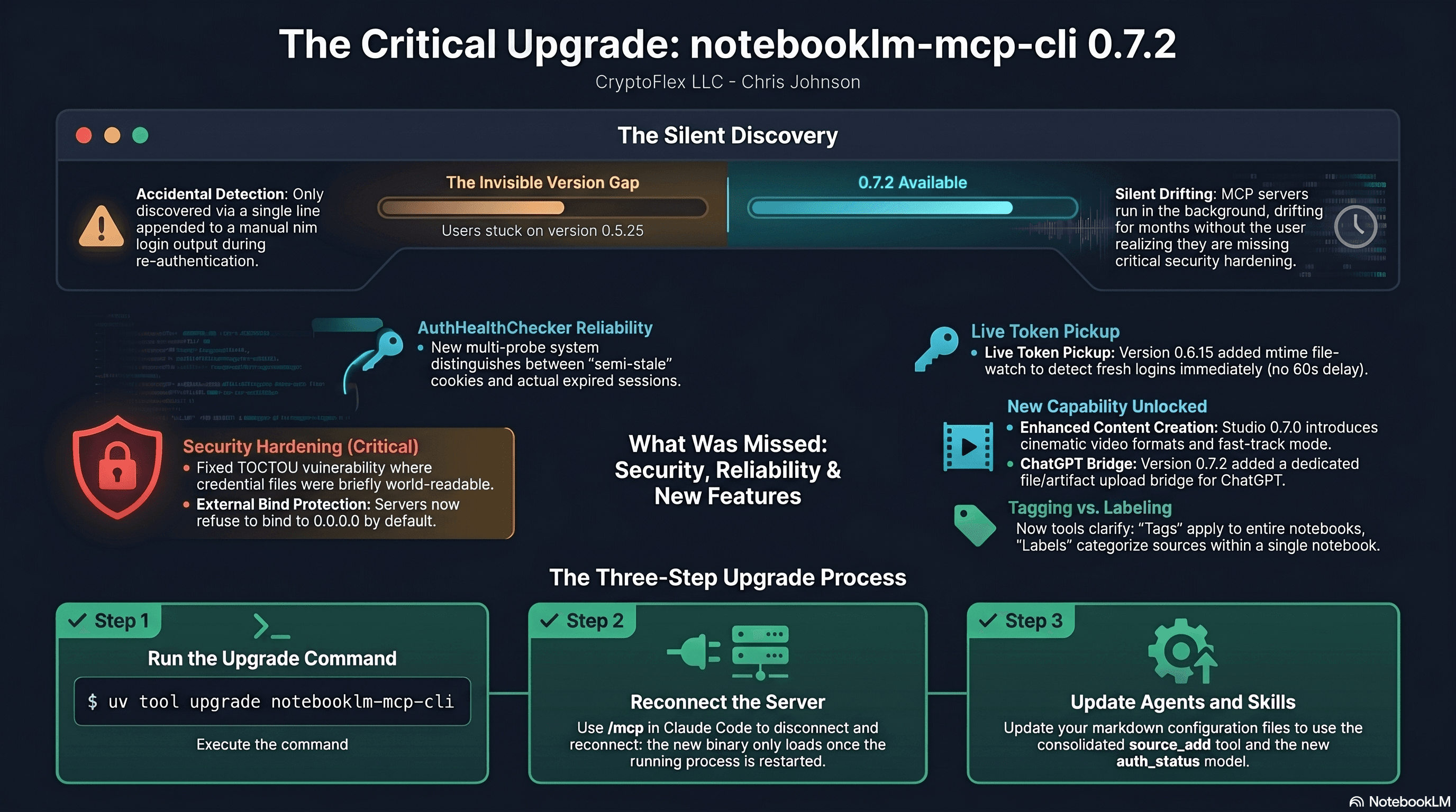
I was two minor versions behind on notebooklm-mcp-cli and had no idea until a re-auth banner interrupted a session. The gap was 0.5.25 to 0.7.2. Security fixes, auth reliability improvements, and new features I was missing the whole time. Here is the three-part upgrade that most people stop after step one.
My Gmail assistant ran clean for two months, then quietly died for a full week before I noticed. The bridge daemon that drove it had pinned itself to a stale Claude CLI version, every scheduled fire failed within seconds, and no transcript was ever written. This post walks through why I migrated the agent off Claude Routines and onto the Claude Agent SDK, what the new stack looks like on launchd, and the parity gate that has to pass before the old agent gets decommissioned.
Comments
Subscribers only — enter your subscriber email to comment