
Ledgerly: Handing the Same Design System to Eight Agents
Ledgerly's UI still worked but looked like stock shadcn, so the whole thing went through Claude Design and came back wearing CryptoFlex's Cyber Editorial system, the same one from April's site rebuild. Eight parallel agents rebuilt every screen against real backend constraints while 46 Playwright tests stayed green, one of them written to prove a SQLite migration bug on purpose.
Ledgerly worked, every screen doing its job, the aggregates correct and the tests passing. It also looked like every other shadcn/ui app on the internet, mine included.
That was exactly what it was: the default theme, barely touched, sitting on top of a database that actually mattered to me.
Part one built that app. Part two taught its chat to query the database directly instead of working from a stale summary. Neither pass touched how any of it looked. Neither pass was supposed to.
This one was. I redesigned all seven screens in Claude Design, the same tool and the same design system I used on this site back in April.
Then I handed the result to Claude Code and watched eight agents rebuild the UI in one session, while 46 Playwright tests stayed green.
The App That Worked and Looked Like Nothing#
I don't find the old dashboard embarrassing, exactly. It's just default. Six nav items with lucide icons, no counts anywhere, a donut chart with a legend, a line chart with a fully labelled axis.
Total spending for the month: $3,052.39. Nothing about it is wrong. Nothing about it says anything either.
Every screenshot in this post, old and new, comes from the same seeded ledger. That's 141 generated transactions spanning six months, imported through the app's own import API into a scratch database.
None of it is my real financial data, or anyone else's. I'll get into how I kept the comparison honest later. For now, just know the numbers are fake and consistent.
The old app followed the OS color scheme, which I'd set up in part one and then never thought about again.
This is genuinely what it looked like most days, whichever mode my laptop happened to be in when I opened it.
Sentence-case headings, sans-serif numbers, a category legend doing the work a design should be doing on its own.
None of that broke anything. The data underneath was solid: real aggregates, real budgets, a working chat. I just didn't want to open my own budget and feel nothing.
A Design System That Already Existed#
Before I typed a single prompt into Claude Design, the CryptoFlex "Cyber Editorial" system already existed as a saved asset inside the tool. It was not just a look I remembered from the last redesign.
I built it for this site's editorial redesign back in April, and that post covers the mechanics: the OKLCH accent nudge, the bundle contents, the six-phase build. I'm not repeating any of that here.
The question I actually wanted answered: had the system held, or did it just get eyeballed and copied by hand a second time? I didn't take Claude Design's word for it. I went looking in the exported prototype file itself.
Ledgerly's prototype is a single self-contained HTML file, 783 lines. Its <head> doesn't inline a copy of the brand. It links to it. Nine <link> and <script> tags, all pointing at one directory:
_ds/cryptoflex-design-system-<uuid>/tokens/fonts.css
_ds/cryptoflex-design-system-<uuid>/tokens/colors.css
_ds/cryptoflex-design-system-<uuid>/tokens/typography.css
_ds/cryptoflex-design-system-<uuid>/tokens/spacing.css
_ds/cryptoflex-design-system-<uuid>/tokens/elevation.css
_ds/cryptoflex-design-system-<uuid>/tokens/motion.css
_ds/cryptoflex-design-system-<uuid>/tokens/base.css
_ds/cryptoflex-design-system-<uuid>/styles.css
_ds/cryptoflex-design-system-<uuid>/_ds_bundle.js
I've redacted the real identifier there. It's a UUID Claude Design assigns to the design system record internally.
Six token sheets, one compiled stylesheet, one bundle script. All of it referenced by path, from a prototype that otherwise has nothing to do with cryptoflexllc.com. That's the whole argument in one file listing.
Ledgerly did not fork the brand. It did not eyeball the old site's colors and copy them by hand. It pulled from the same design system record, and this is the second project to do that, not the first.
Here's what that fan-out actually looks like, in my own words rather than the tool's: one record, three consumers, one of them still hypothetical.
Swipe to see the full diagram · Tap to enlarge
A Design System Is an Asset Now, Not a Memory
Claude Design treats a design system as a saved, referenceable record inside the tool itself, not a file you export and copy between repos. That's also its limit: the record lives in Claude Design's storage, not in either codebase, so verifying it meant reading the prototype's <head> rather than diffing a shared file in git. Building it once for April meant Ledgerly could link to it in August instead of rebuilding it, and whatever comes after Ledgerly inherits the same six sheets on day one.
That matters past the file structure. I've now used this system on two projects with nothing else in common: a marketing and blog site, and a personal finance dashboard.
Neither one required me to relearn what "on brand" means here. The teal showed up on its own.
So did the type trio, Space Grotesk for UI, JetBrains Mono for every number and label, Source Serif 4 italic for ledes.
So did the 4px radius on cards and the 2px radius on tags, and the rule that nothing is a pill.
All of it, because I asked Claude Design to build against the system instead of building a look from nothing.
One place the brand did not get to overrule anything, and I checked for exactly this: category colors. Ledgerly's seed data already carried hex values for income, groceries, dining, and every other category, set back in part one before any of this existed.
The handoff kept them verbatim. When a design system meets data that already has its own meaning, the data wins. I liked that the tool didn't try to argue with it.
The next project, whatever it turns out to be, won't start from a blank canvas in Claude Design.
It'll start from the same six token sheets Ledgerly just linked to. Anything I add to the system this time carries forward automatically.
Designed Against the Real Backend, Not Free-Floating Art#
All seven screens got designed against the app's actual backend, not as art with numbers filled in later.
Two details in the README prove it, and both surprised me a little when I reread the handoff after the build finished.
The recurrings table in the design maps one to one onto RecurringMerchantRow, a type that already existed in Ledgerly's codebase before any of this started.
Merchant, cadence, months seen, average per month, last charge, status. Every column in the mockup has a real field waiting for it.
The income-vs-expenses card did the opposite. It forced a change. Ledgerly's existing trend query, getTrend, deliberately excluded income; it was built for spending, not for a full income-versus-expenses view.
I wanted both lines on one chart, and the design itself specified a brand-new aggregate before a single line of implementation code existed.
I don't think that's a small distinction. A design tool that hands you a picture leaves the backend question for later, and "later" is where scope creep and half-finished features live.
A design tool pointed at real types and real queries surfaces that gap during design, when it's still cheap to fix. I'd rather find that gap in a README than in a pull request.
Point the Design Tool at Real Types, Not Placeholder Data
This only helps if the types you point it at are still true. A stale RecurringMerchantRow would have specified a screen against a shape that no longer matched production, and the mismatch wouldn't have surfaced until implementation. Ledgerly's types happened to be current; that's not guaranteed by default, so check first before the design pass starts.
The Handoff Bundle, Briefly#
Claude Design exported everything into design_handoff_ledgerly_rebuild/ in the repo: a 2,620-byte prompt file, a 64,316-byte prototype, a 13,523-byte README, seven screenshots, two token sheets. I didn't touch any of it by hand.
README.md is the source of truth, structured the same way April's bundle was: overview, fidelity, file list, global shell, card pattern, one subsection per screen, interactions, state management, tokens, assets.
I already covered what one of these bundles looks like, and why the structure matters, in the April post.
This one follows the same shape almost exactly. If the structure is nearly identical to April's, what actually earns its own section? The prompt underneath it, which is where the rest of this post lives.
A Prompt That Fuses Every UI Change to Its Backend Change#
Nineteen lines. That's the entire prompt Claude Design writes for you to hand to Claude Code. It's the artifact I keep coming back to, because it isn't "build this UI." Here's how it opens:
Rebuild Ledgerly's UI to match the high-fidelity design in `design_handoff_ledgerly_rebuild/`. Read `README.md` in that folder first — it is the source of truth. `Ledgerly Rebuild.dc.html` contains every exact measurement, color, and copy string as inline styles; `screenshots/` shows each target screen; `tokens/*.css` are the design-token sheets.
And here's how it closes, after five numbered scope items:
Rules: follow the existing codebase patterns (server components + aggregates in `src/lib`, shadcn/base-ui primitives, cents-only money via `formatCents`). Keep every existing test green (`pnpm check`), and update the e2e specs that assert nav labels/empty-state copy where the design changes them. The HTML file is a design reference, not code to import — recreate it in React/Tailwind. Work screen by screen, comparing against the screenshots as you go.
Every scope item fuses a UI instruction to the exact backend change that UI requires. It doesn't say "add balances to the sidebar." It names the migration for balance_cents.
It doesn't say "let people mark transactions reviewed." It names the migration for reviewed. It says outright to add an income aggregate to src/lib/analytics/aggregates.ts, and it says why: getTrend currently excludes income.
It names exact files by path: app-sidebar.tsx, app-shell.tsx, NAV_ITEMS. No ambiguity about where a change lands.
It draws a hard line between screens that only get restyled, transactions, budgets and goals, reports, chat, "without changing their existing behavior," and screens that get rebuilt with new data underneath.
And it sets a runnable command as the actual definition of done: pnpm check, not my eyeballs on a screenshot.
It also pre-empts the single failure mode most likely to happen: an agent importing the HTML wholesale instead of recreating it. I watch for that failure mode now on every handoff.
The prompt says so directly, twice, once in the scope and once in the rules. That's not an accident. It's the one line every version of this prompt across two projects has kept intact.
Measurements as Inline Styles Beat a Design-Tool Link
Every pixel value, color, and copy string in Ledgerly Rebuild.dc.html sits as an inline style an agent can read directly. No rendering, no API call to a design service, no screenshot to interpret. The file is also plain text sitting in the repo next to the code it describes, so it diffs like anything else and never goes stale the way a link to an external tool eventually does.
A few more lines from the README show the same precision. The card pattern, used on every panel in the app:
1px var(--border) border, 4px radius, var(--surface-1) fill, 20px padding, no shadow.
Spacing, quoted whole:
Spacing: 8px grid; card padding 20px; grid gaps 20px; radii 4px (cards/inputs/buttons), 2px (tags/chips), 50% dots only — nothing is a pill.
And the interaction rules that govern every hover and focus state:
- Hovers: rows tint var(--accent-dim); outlined controls go teal border + teal text; primary button brightens only. Transitions 140–220ms. No scale/bounce on cards.
- Focus: 2px solid var(--ring) at 2px offset, never removed.
The recurrings table's grid template is right there too: 1.5fr 96px 80px 110px 96px 96px 82px. Seven exact column widths an agent can read without rendering anything.
Three Decisions Before Any Code#
Before any of the eight agents touched a file, the session ran in plan mode.
Three Explore agents mapped the UI layer, the data layer, and the test surface, all in parallel. A Plan agent turned what they found into a phased build.
That planning pass surfaced two gaps the handoff implied but never actually named. The spend-pace chart needed a brand-new daily cumulative-spend aggregate that didn't exist anywhere in the codebase.
The recurrings table needed last-charge dates and account names the existing query didn't return. Both were small enough to miss in the README.
Both were big enough to block a screen if they'd surfaced mid-build instead of during planning.
Three decisions came back to me as plain questions, not defaults the agents picked on their own.
Account groups, credit cards, depository, investment, could live as a new value on the accounts type enum, or as a separate column. The enum meant a real SQLite table-rebuild migration; the column would have been cheaper to ship. Was the migration the right trade? A type is what this actually is, and that's what decided it.
I didn't want a workaround baked into the schema for years, just because a migration looked like more work on a Tuesday.
Balances could be manual, display-only, or derived from transaction history. I picked manual: an onboarding field, an import-wizard field, and click-to-edit right in the sidebar.
Derived balances sound cleaner until you remember Ledgerly does not see every account's activity in real time, only what gets imported. A derived number that's quietly wrong is worse than a manual one I know is manual.
And dark mode: always-dark, matching the design's native intent, or follow the OS the way the old app did. I picked follow the OS.
Dark stays the native :root palette; the light palette lives under prefers-color-scheme: light instead of being treated as the exception.
It's a small reversal of which mode counts as "default" in the CSS. I think it's also the right one. I don't get to decide what mode someone's laptop is in when they open their own budget.
Eight Agents, One Codebase, No Collisions#
The build itself ran as eight concurrent agents plus the main session, once planning closed. I watched the session log scroll the whole time.
A db-engineer agent owned schema migrations and analytics end to end.
It's the reason four new functions exist that didn't before: getCashflowTrend, getDailyCumulativeSpend, and getReviewInbox are queries, toggleReviewed is a mutator, plus a pure, database-free schedule module, src/lib/analytics/recurring-schedule.ts, exporting nextExpectedDate, isOverdue, cadenceLabel, and getUpcomingRecurrings.
Migration 0004 rebuilt accounts. Migration 0005 added transactions.reviewed, the flag the dashboard's review inbox now persists.
Six UI agents split the interface by route, one directory and its matching e2e spec file per agent: transactions, budgets, chat, cashflow, recurrings, reports, and import plus onboarding together.
That's seven route-and-spec pairs across six agents. The main session kept the theme foundation, the shared components, the sidebar, and the dashboard for itself, since those touch everything else.
Eight agents, one UI codebase, and somehow nothing collided. How? One ownership boundary is the actual answer. One agent per route directory. The same agent owns the spec that tests that route.
Nobody edits a file another agent is also editing. Nobody's UI change can silently break a test I or someone else wrote, because the person who changed the markup is the same person who'd have to fix the assertion.
Charts came from recharts, with the library's defaults stripped down to what the README specified: grid lines gone, axes reduced to a hairline or hidden outright, legends stripped back to a two-dot marker where one earns its place, series colors pulled straight from the design tokens.
The dashboard's teal-income-against-amber-expenses pairing got checked for colorblind accessibility during the session: a delta-E of 17.4 in dark mode and 12.7 in light mode, measured under a color-vision-deficiency simulation against a target of 8.
A Real Check, Not a Repeatable One
That delta-E measurement happened once, during the session, using a simulation I didn't keep. It isn't a script sitting in the repo, so I can't rerun it on demand or point you at it. It happened and it passed comfortably, and that's the whole claim I'm making.
The Migration That Silently Did Nothing#
Migration 0004 was supposed to be routine: add the investment account type and a balance_cents column, both changes the sidebar redesign needed. It broke instead, and the reason took real digging to find.
SQLite documents PRAGMA foreign_keys as a no-op while a transaction is already open.
You can flip it, and SQLite will let you, and it will change nothing until the transaction closes. drizzle-orm's migrate() function wraps every pending migration in one BEGIN/COMMIT block.
So when drizzle-kit generates a table-rebuild migration that turns the pragma off itself, expecting to disable foreign-key checking for the duration of the rebuild, that toggle does nothing. It is already inside somebody else's transaction.
accounts is the foreign-key parent of both transactions.account_id and import_batches.account_id. Why did the failure show up on my database, then, and not wherever the migration was first generated?
Against a database that already had rows in either table, and mine did, dropping and rebuilding accounts failed with FOREIGN KEY constraint failed right on the DROP TABLE step. A fresh, empty database would never have hit it.
Here's the actual generated migration, drizzle/0004_heavy_vargas.sql, first line and last:
PRAGMA foreign_keys=OFF;--> statement-breakpoint
...
PRAGMA foreign_keys=ON;
Both lines are real. Both are exactly where drizzle-kit put them. Neither one does anything, because both sit inside the transaction migrate() already opened around them.
The fix moved the toggle out of the generated SQL entirely, into the app's own migration runner. It lives in src/db/client.ts, where it happens outside any transaction:
sqlite.pragma("foreign_keys = OFF");
migrate(db, { migrationsFolder: MIGRATIONS_FOLDER });
sqlite.pragma("foreign_keys = ON");
The comment above those three lines ends with a sentence I like enough to quote whole: "Toggling the pragma here, outside any transaction, is the actual point of control."
The db-engineer agent didn't take the fix on faith either. It reproduced the original failure first, against a database seeded with real child rows, and only then wrote the fix.
Afterward it wrote two regression tests in src/db/migration-0004.test.ts, not one. The first is the ordinary kind: apply the migration the way production applies it, then assert expect(sqlite.pragma("foreign_key_check")).toEqual([]).
The second test is the one I keep thinking about. It deliberately recreates the broken conditions, foreign keys left on across the migration's own transaction, and asserts that the original failure still happens.
Its name starts "(documents the real production bug this migration would otherwise have) fails on the DROP TABLE step when foreign_keys stays ON across the migration's own transaction." That's a test written to fail under the old code and pass under the new one, by proving the bug is still reachable, not just that the fix works.
One more thing turned up in the same generated file. drizzle-kit's rebuild statement tried to SELECT the brand-new balance_cents column from the old version of accounts, before that column existed anywhere.
A column that doesn't exist yet can't be selected from a table that doesn't have it yet.
Generated Table-Rebuild SQL Needs a Read, Not Just a Run
Two separate bugs came out of one generated migration file: a pragma toggle that silently did nothing, and a SELECT for a column that didn't exist yet in the source table. drizzle-kit generates this SQL; it doesn't verify it against the actual order a rebuild runs in.
Forty-Six Tests, and the Five Spec Files That Never Moved#
E2E needed one workaround before any of this could even run. My own dev server holds Next's project-wide dev lock on port 3210, permanently, because I leave it running.
A temporary env-driven build directory let Playwright build and serve its own copy without fighting that lock, reverted once the run finished.
playwright.config.ts sets reuseExistingServer: false on purpose, and the comment next to it explains why in one sentence: the server on 3210 is the real one, serving the actual gitignored finance.db, and if E2E ever picked up that port instead of starting its own, every spec run would mutate real financial data.
Never Let Test Automation Share a Port With Real Data
This only works because the check is a config flag, not a runtime guard. If reuseExistingServer ever got flipped to true, in a merge or a config copied from another project, nothing else would stop Playwright from attaching to port 3210. The port number itself carries no protection. Any project reusing this pattern needs the same one-line guard, set deliberately, every time it's copied.
Underneath the UI, 1,181 unit tests stayed green through the same rebuild, at roughly 96% statement coverage against an 80% gate the project enforces on every commit. That's before the e2e suite even runs.
The e2e number: 42 tests in the main suite plus 4 in a separate no-AI suite, 46 total, all green after a full visual rebuild of every screen in the app.
Start with transactions.spec.ts. Six tests, not one line touched, even though every pixel on that screen changed: new overline, new lede, filters turned into chips, headers turned mono uppercase, categories turned into colored tags. I didn't touch that spec on purpose, and I didn't have to. It's the actual proof behind the CSS-uppercase and aria-hidden argument later in this section, not a footnote to it.
transactions.spec.ts wasn't alone. Five of the ten spec files in e2e/ never got touched at all: chat.spec.ts, import.spec.ts, onboarding.spec.ts, smoke.spec.ts, and transactions.spec.ts itself, eighteen tests between them, through a rebuild that changed every screen those specs cover.
That number is bigger than it looks on disk, too. There are only 39 literal test( calls anywhere in e2e/; nav.spec.ts alone parameterizes a single test over a table of eight nav entries, so three source-level tests become ten at runtime. For every entry, that table asserts the exact link label and the exact empty-state heading of the page it lands on: "Dashboard" and "Nothing to show yet," "Transactions" and "No transactions yet," "Cash flow" and "No cash flow to chart yet." Those are precisely the strings a full redesign rewrites without thinking twice, and this time the table itself changed too.
Five spec files did change: budgets.spec.ts, dashboard.spec.ts, nav.spec.ts, no-ai.spec.ts, and reports.spec.ts, 120 insertions and 84 deletions across all five. Every one of them changed because the product changed, not because the paint did.
nav.spec.ts grew because the nav itself grew, from six entries to eight. Cash flow and recurrings got added, and Import moved to last. dashboard.spec.ts changed because the dashboard swapped which cards exist: assertions for "Spending by category," "Budgets for November 2019," "Top merchants in November 2019," and "Spending trend (6 months)" came out, and assertions for "Monthly spending," "Top categories," "Income vs expenses," and "Transactions to review" went in. It picked up an entirely new test too, one that checks off a transaction in the review inbox and confirms the count decrements and persists. The month label format changed along the way, from "November 2019" to "Nov 2019," so those assertions moved for that reason as well.
The suite grew, not shrank. Before the rebuild: 38 literal test( calls against a six-entry nav table, 43 tests at runtime. After: 39 calls against an eight-entry table, 46 at runtime. Nothing got deleted, nothing got weakened, and the count went up by three.
What genuinely didn't change is the selector style. Before and after, every spec locates things with getByRole and an accessible name. The rebuild never forced a single assertion down to a CSS selector or a test id, and that discipline is what makes the rest of this section true. Almost all the uppercase you see in the new screenshots isn't in the DOM at all. It's CSS. Real code from app-sidebar.tsx:
<div className="pt-3 font-mono text-[10px] tracking-[0.14em] text-fg-3 uppercase">
  My accounts
</div>
The accessible name stays "My accounts." The screen shows "MY ACCOUNTS." Playwright, and every screen reader, sees the first one.
One element, two outputs, and I like how flatly that separation holds: what the eye reads and what the matcher reads never had to agree.
Swipe to see the full diagram · Tap to enlarge
Why Case and Decoration Don't Break Role-Based Assertions
Playwright's role-based matchers check the accessible name, which for text content is whatever's actually in the DOM, not what CSS renders it as. Matching is also substring-based and case-insensitive by default. A text-transform: uppercase class changes what a user sees without changing what an assertion or a screen reader hears. Typographic marks tucked into aria-hidden spans never enter the accessible name at all.
The nav's typographic marks work the same way, on purpose.
The registry comment in nav-items.ts states the intent plainly: "The design system uses typographic marks instead of icon glyphs; each mark renders in a mono span (aria-hidden) so the accessible link name stays the bare label." The mark and the label sit in separate spans:
<span aria-hidden="true" className={cn("w-3.5 shrink-0 text-center font-mono text-[11px]", isActive ? "text-primary" : "text-fg-4")}>
  {item.mark}
</span>
<span className="sr-only flex-1 truncate lg:not-sr-only">{item.label}</span>
I didn't expect that going in, but because matching is substring-based, decoration, case, and even the icon-to-mark swap all sat outside what the tests were actually checking. "Generate AI summary," "New chat," "Send." None of those specific accessible names moved, whether the file around them changed for other reasons or not.
One test pinned a styling choice on purpose, and it stayed pinned. The transactions table keeps a literal opacity-50 class on excluded rows, because a spec asserts that exact class. From transactions-table.tsx:
<TableRow className={row.excluded ? "opacity-50" : undefined}>
And from e2e/transactions.spec.ts, the file that never got touched:
await expect(groceryRow).toHaveClass(/opacity-50/);
Nobody redesigned that detail away. The test wouldn't have let them, and nobody tried. I wouldn't have either.
Same Ledger, Different Framing#
The before-and-after pairs below are all dark mode against dark mode, on purpose. It would be easy to grab a light-mode "before" shot next to a dark-mode "after" and let the contrast do work that isn't real.
So I didn't. Every pair here is the same theme on both sides. The only thing that changed is the design.
Could I just be asserting that, though? Old shots came from a git worktree checked out at the pre-rebuild commit.
New shots came from a separate worktree at the current commit. Both point at the same seeded scratch database, so the numbers below aren't just similar. They're identical.
Watch the total. The old dashboard's donut chart reads $3,052.39.
The new dashboard's spend-pace annotation reads "$3,052 spent · day 12." Same month, same ledger, same number, read two different ways. That's what makes this comparison controlled instead of staged.
Almost everything moved. The donut is gone.
A spend-pace chart replaced it, and I'd argue it's the more honest chart, since a "$1,551 over pace" chip tells you something a total spent this month doesn't: whether you're actually on track. The review inbox is new.
The recurrings preview is new. The top-categories bars stopped encoding category identity and started encoding budget health instead: shopping shows red because it's over budget, housing shows amber because it's close.
I don't read that as a palette swap. It's a different decision about what a bar's color should mean.
I picked the transactions screen as the cleaner comparison, because the underlying table barely changed.
Same rows, same order, same dates. What changed is entirely presentation. Labelled filter fields became chips with a row count next to them.
A category dropdown became a bordered tag colored from that category's own hex. Every header went from sentence case to mono uppercase. Nobody touched the filtering logic. Nobody had to.
Reports got the least visual drama and the most new information density.
The export row picked up one new chip, PRINT VIEW, next to PDF, Excel, and CSV; the AI summary button still hides when AI is unavailable, exactly as report-preview.tsx already behaved. Past that one chip, what's new is the framing.
Three stat cards up top instead of one buried number. A dashed placeholder for the AI narrative that reads like part of the design instead of an empty state apologizing for itself.
Cash flow and recurrings don't get a before shot, because there wasn't one. Both routes didn't exist until this rebuild, and I didn't fake one for the comparison.
The recurrings table is the same one from earlier, mapped straight onto RecurringMerchantRow. Twelve merchants, twelve status pills, all live.
The design specified this screen against a type that already existed. The screenshot is what that looks like once it's real.
Where the Series Picks Up#
One commit landed all of it, 7652d7d feat: rebuild UI to the Cyber Editorial design system. Underneath the new paint sit the two migrations, the aggregate functions and schedule module the new screens needed, a review inbox with a real reviewed flag persisting to the database, and a sidebar that actually knows my account balances because I told it what they are.
The design system itself is the one thing here that didn't get invented for this rebuild. It got reused from April, and it held up under a personal-finance dashboard as well as it held up under a blog.
What's different now is what I actually open when I check my own spending: a screen that says something, instead of one that just sits there being correct.
Weekly Digest
Get a weekly email with what I learned, summaries of new posts, and direct links. No spam, unsubscribe anytime.

Related Posts
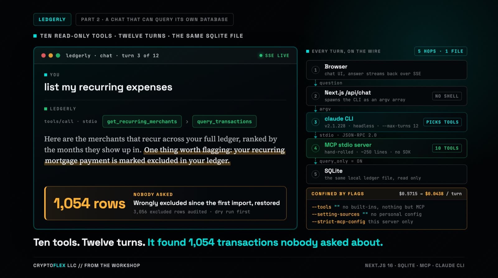
Part one's chat answered from two months of category totals stuffed into a single-turn prompt, and it could not run one query against the database sitting right there. Part two replaces that with a hand-rolled MCP server, ten read-only tools, and multi-turn tool calling confined by CLI flags a de-risking spike worked out against the real claude CLI. Three review passes ran before the commit, and one confirmed finding was a tool-name mismatch that every unit test passed and only a captured NDJSON fixture caught. The same work also turned up a data problem that had nothing to do with any of it: 1,054 real transactions wrongly marked excluded since the original import in part one.
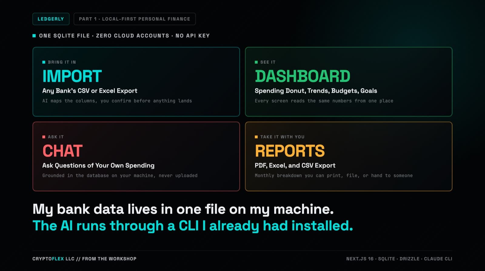
I wanted a personal finance app that molds to how I actually track money: any bank's CSV or Excel export, real categorization, budgets and goals, and an AI I can ask questions of my own spending. Ledgerly is what I built: local-first, one SQLite file on my machine, no cloud, and AI that runs through the Claude CLI I already have installed. This is part one of the series, covering the use case, the build, and two bugs a layman QA gate caught before I started running v1 against my real money.
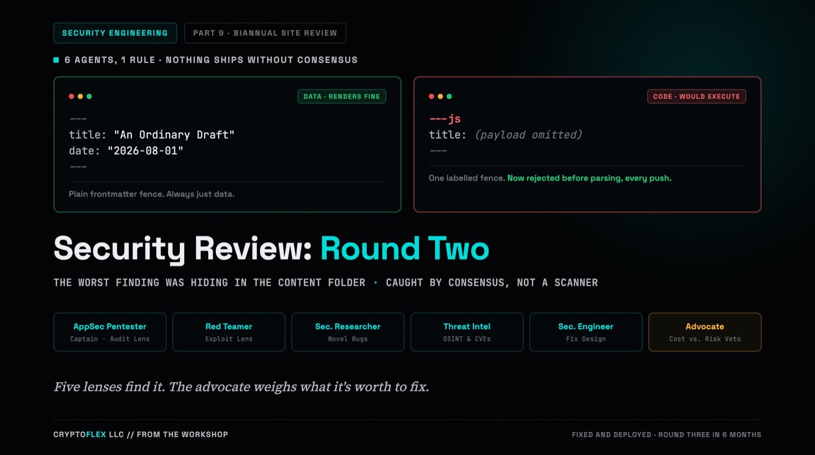
A team of six agents, five security specialists plus an advocate representing the site owner, ran a consensus-driven security review of cryptoflexllc.com. The standout finding: an ordinary-looking blog draft that could have been parsed as executable code instead of data.
Comments
Subscribers only — enter your subscriber email to comment